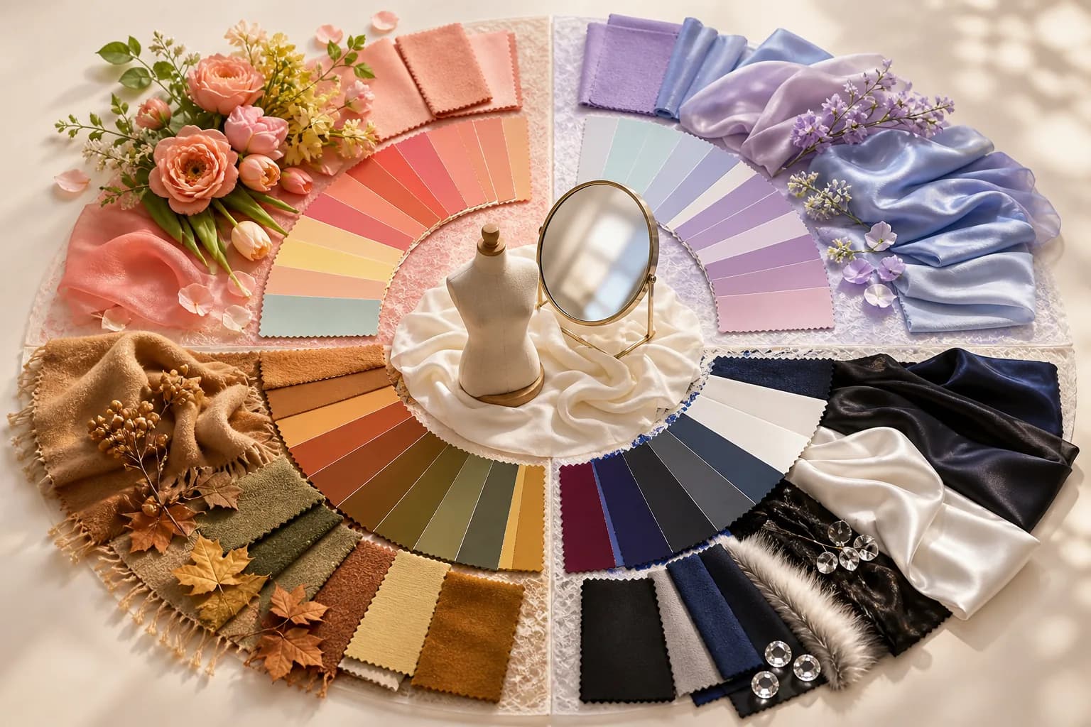
The four seasons really come down to three axes
When you first try to sort out personal color, the most confusing part is usually the names: spring, summer, autumn, and winter. Because they're named after seasons, it can feel like you're picking your favorite time of year. In reality, these are nicknames for combinations of three axes used to sort colors. Those three axes are temperature (warm vs cool), value (light vs dark), and chroma (clear vs muted). Once these three settle into your head, any palette starts to make sense.
Temperature is about whether a color leans yellow or blue. The same pink can split into warm if it carries a peachy glow or cool if it carries a blue undertone. Value tells you how light or dark a color is, and chroma tells you how vivid and crisp it is versus how softly muted it feels. It's essentially the same idea as the three attributes of color used in color theory, so you can think of it that way.
The four seasons simply bundle these axes together. Spring and autumn fall on the warm side, summer and winter on the cool side, and then whether a type is bright and clear or deep and calm splits each into branches. So instead of immediately hunting for 'which season am I,' it's far easier to start by lightly sensing whether your overall impression leans warm or cool. This article walks through it in that order, slowly.
One promise up front: everything here is about the impression a color gives and a styling reference, nothing more. Saying a color suits you means it helps the mood of the day; it does not speak to anyone's personality or ability. Read it with the mindset that color is a playful, enjoyable thing to choose, and you'll get the most out of it.
Spring warm — bright, fresh warmth
Spring warm pairs a warm temperature with a light value and clear chroma. Picture an early-spring flower field as the sunlight first spreads, and the mood comes into view. Overall it feels light and radiant, with colors that seem to lift and glow on the face. Heavy, dark colors tend to weigh the face down, so the fresher you go, the more the mood comes alive.
Spring warm best colors
Coral, apricot, peach, bright gold, a yellow-leaning green, and warm ivory are signature colors that flatter spring warm. What they share is a touch of yellow while staying clear and bright. For makeup, coral and peach blush and lip lift the face, and for clothes, cream ivory or light camel makes an easy, warm mood. Gold accessories tend to blend in better than silver here.
Spring warm worst colors
On the other hand, jet black, cool gray, blue-heavy burgundy, and muddy khaki tend to clash with spring warm's brightness. Deep black especially can make the outfit register before the face, which can flatten the mood. If you really want a dark color, keep a bright color near the face and push the dark color lower. Think of it purely as a suggestion to help you look more radiant.
| Season type | Temperature & criteria | Signature colors | Colors to avoid | One-line mood |
|---|---|---|---|---|
| Spring warm | Warm / light / clear | Coral, peach, bright gold, ivory | Jet black, cool gray | Radiant like sunlight |
| Summer cool | Cool / light / soft | Lavender, rose pink, sky blue, soft gray | Deep orange, mustard | Clear and soft like mist |
| Autumn warm | Warm / dark / soft | Camel, caramel, mustard, khaki | Piercing neons, blue pastels | Deep and mellow like fall leaves |
| Winter cool | Cool / high contrast / crisp | Pure white, deep black, magenta, royal blue | Muddy beige, washed khaki | Crisp like a winter landscape |
Summer cool — soft, cool pastels
Summer cool combines a cool temperature with a light value and softly muted chroma. Like a lightly misty summer morning, its charm is a gentle, calm tone. When a color is too piercing, the face can feel overpowered, but soft colors with a slight blue undertone keep the impression clear and at ease. If spring warm is 'radiance,' it helps to remember summer cool as 'clear and soft.'
Summer cool best colors
Lavender, rose pink, sky blue, soft gray, and a blue-leaning white are summer cool's best companions. Because they're pastels with the chroma turned down a notch, the mood settles elegantly. In makeup, blue-toned pink or rose blends in naturally, and for clothes, light gray or dusty blue makes a clean yet soft impression. Silver or white gold accessories tend to suit it well.
Summer cool worst colors
Strong orange, deep gold, mustard, and muddy camel — colors heavy in yellow — tend to cross slightly with summer cool's clear tone. Placing warm, deep colors near the face can make the tone feel dull. Still, you don't have to give up colors you love. Adding a blue-leaning layer with a scarf or an inner top softens the balance considerably.
Autumn warm — deep, mellow warmth
Autumn warm blends a warm temperature with a low value and softly muted chroma. Deep, mellow colors like autumn leaves, earth, and ripened grain suit it well. It's on the warm side just like spring, but where spring is bright and clear, autumn settles a tone lower for a calm, refined mood. The point is that the impression comes alive when you layer heavier, settled colors rather than overly bright, piercing ones.
Because of this, autumn warm tends to carry deep colors comfortably. Dark colors blend naturally with the mood instead of weighing the face down. Even within beige, the more it leans toward camel and caramel — with yellow warmth and depth together — the better it fits. If you enjoy colors with weight to them, the autumn warm palette will be a reliable guide.
Winter cool — crisp, high-contrast colors
Winter cool blends a cool temperature with high contrast and crisp chroma. Like vivid colors set against a snowy landscape, the impression comes alive when you layer clear, defined colors rather than hazy ones. It's on the cool side like summer, but where summer is soft pastels, winter's charm is strong contrast and crispness. In-between, washed-out colors can actually make the face look blurry.
So winter cool often carries deep black, pure white, and vivid primaries with ease. Colors that are clearly defined — a blue-leaning red, magenta, royal blue, emerald — tend to fit. Because clear contrast makes the impression look composed, coordinating looks that play up a defined contrast suits it better than matching top and bottom too closely. If strong colors feel like a lot, start by pairing white with a single crisp color.
Borderline cases, season drift, and finding your coordinates at home
In truth, many people don't land neatly in just one of the four seasons. Being on the border — a warm somewhere between spring and autumn, or a cool between summer and winter — is genuinely common. In that case, rather than declaring 'I am definitely such-and-such,' it's more practical to fix the big direction of warm or cool and then move freely between bright and deep colors within it. Personal color is less a set of partitions and more a compass pointing a direction.
It also helps to know about 'season drift.' Even for the same person, the weight of flattering colors shifts a little with tanning, hair color, and the day's lighting. If you're lightly tanned in summer, crisper colors may suit you more than usual, and if you lighten your hair, lighter colors can look fresher. Thinking of it as coordinates that wobble with your condition, rather than a fixed answer, makes it easier to enjoy.
Finally, please remember that the impression a color gives is just that — an impression. A flattering color can help someone look more radiant, but it does not speak to their personality or ability. Personal color is a tool for dressing yourself with more joy, not a label that defines you. So map your coordinates, but keep it light and fun.
How to find your coordinates at home
You can sense your direction at home well enough without any fancy tools. The easiest method is to alternate a gold cloth and a silver cloth next to a bare face under natural light by a window. If the face looks brighter and livelier against the gold, you likely lean warm; if it looks clearer and cleaner against the silver, you likely lean cool. Holding up bright and deep colors the same way gives you a sense of the value direction too. It's a fun self-check, so take the result lightly.
What to watch for when checking by photo
When comparing colors by photo, remember that lighting heavily sways the result. Under warm incandescent light every color reads yellow, and under cool fluorescent light it reads blue, so the same outfit can look like a completely different tone. Where possible, compare in midday natural light, with beautifying filters off, and against a white background to judge more crisply. Taking several shots and reading the average impression is also a good approach.
Article info & references
Published June 7, 2026 · Last updated June 7, 2026
- General color-theory concept of the three attributes of color (temperature, value, chroma), as in the Munsell color system
- General knowledge of how light affects color (color temperature, color rendering)
- General social-psychology concepts of first impressions, such as the primacy effect and halo effect
- General photography principles, such as using natural light and white balance when shooting