Good photos follow color rules
Same person, same expression — yet one photo looks composed and another looks cluttered. The difference often comes down to whether the clothing, background, and lighting colors agree. Scattered colors split attention; colors tied one direction let the face stand out. It isn't hard — a few principles do it.
Principle 1 — let the background step back
The safest setup keeps the background calm and the subject crisp. When the background is lower in chroma or close in tone to your clothes, your face comes forward. A loud neon-pink background steals attention and buries the face — that's why neutral walls and soft natural backdrops rarely fail.
Principle 2 — keep color temperature in one direction
Mixing warm light (yellow bulbs) and cool light (white fluorescents) in one shot makes skin look patchy. Unify the color temperaturewhere you can — one window light, or matching bulbs indoors. Tie clothing and background warm-with-warm or cool-with-cool and the whole photo reads tidy.
Principle 3 — keep it to three colors
The 60-30-10 rule from interiors and fashion works in photos: 60% a base color (usually the background), 30% a secondary (clothes), 10% an accent (props, lip). Too many colors scatter the eye, so pick a main color and narrow the rest to tones that go with it.
Principle 4 — near-face color sets your complexion
The same color matters little far from the face but changes complexion up close. So matching near-face colors — tops, scarves, hats— to your tone is the most efficient move. Warm tones brighten beside ivory and coral; cool tones beside white and blue. Bottoms and shoes are far away, so they're relatively free.
Safe combinations that reduce misses
When unsure, borrow proven pairings. Shades of one color(light beige + dark brown) rarely fail, and neutral + one accent(grey + mustard) looks refined. Complementaries (blue + orange) are striking but should stay small in area. If in doubt, a single-color-family "one-tone" look is safest.
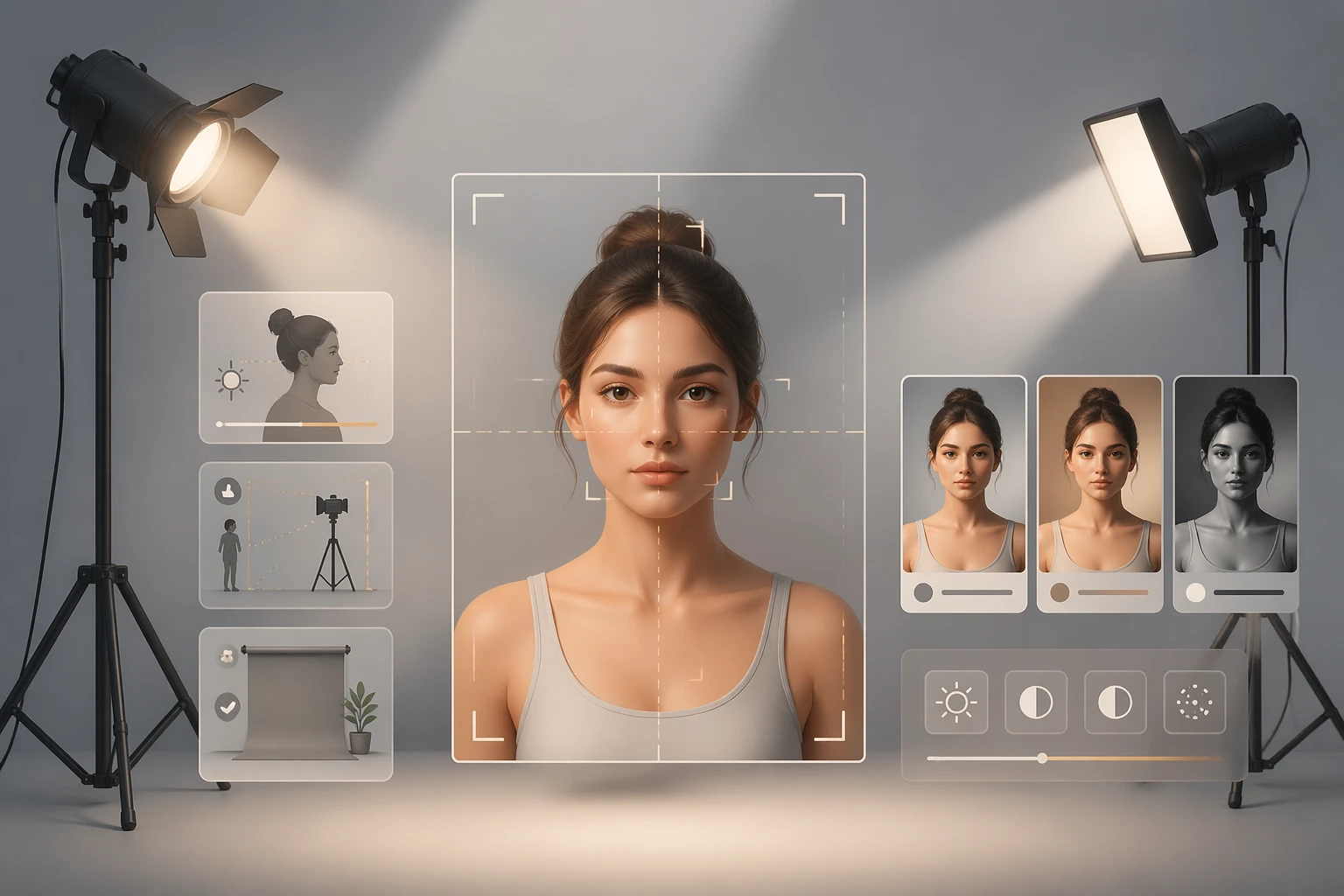
A 10-second check before you shoot
Before the shutter, check three things: the background isn't too busy, the light comes from one direction, and the near-face color matches your tone. Those three alone raise a photo's polish. To see which combination fits your face mood, compare photos as short keywords. It's all a for-fun styling reference.